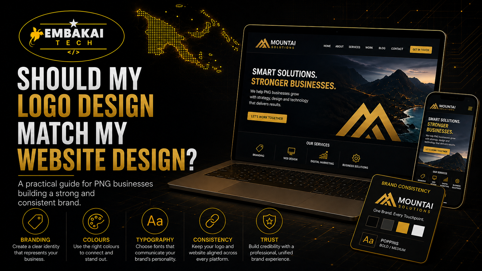
Yes, your logo design should match your website design.
Your logo and website do not need to look exactly the same in every detail, but they should feel like they belong to the same business. The colours, fonts, style, layout, tone, and overall visual identity should work together.
For many businesses in Papua New Guinea, a logo is the first branding item they create. It may appear on invoices, quotations, Facebook pages, uniforms, business cards, signs, banners, vehicles, receipts, and official documents. But when the business later builds a website, the website sometimes looks completely different from the logo.
That creates a branding problem.
If your logo looks corporate but your website looks casual, customers may feel confused. If your logo uses blue and gold but your website uses red, green, and purple, the brand may look inconsistent. If your logo is modern but your website looks outdated, your business may appear less professional.
A good business brand should feel consistent everywhere customers see it.
Your website is one of the most important places where your brand appears. It should support your logo, not fight against it.
This guide explains why your logo design should match your website design, what “matching” really means, and how PNG businesses can build a stronger brand online.
Brand consistency means your business looks and feels the same across different platforms and materials.
This includes your:
When customers see the same colours, logo, fonts, and design style repeatedly, they begin to recognise your business more easily.
For example, if someone sees your Facebook post today, then visits your website tomorrow, then receives your quotation next week, they should feel like all three came from the same company.
That creates trust.
When branding is inconsistent, the business may look unorganised, rushed, or less professional. Customers may wonder whether the website is really yours, whether the page is official, or whether your business pays attention to detail.
In business, small details matter. A consistent brand shows customers that your business is serious.
Your logo is not the whole brand, but it is one of the most important parts of your visual identity.
A logo usually defines or influences:
For example, a law firm logo may use strong, formal colours and clean typography. A coffee brand may use warm colours and natural visual elements. A technology business may use sharp lines, modern icons, and high-contrast colours. A construction business may use bold fonts and industrial colours.
Your website should build from that direction.
If your logo uses black, gold, and white, your website can use those colours as the main brand palette. If your logo has a clean corporate style, your website should also feel structured, professional, and clear. If your logo uses a soft, friendly style, your website should not feel overly harsh or aggressive.
The logo gives the website a visual starting point.
Matching does not mean your website must copy the logo everywhere.
It does not mean placing the logo in every section. It does not mean every button must use the same colour as the logo. It does not mean the whole website should become overloaded with the logo symbol.
Matching means the website should follow the same brand direction.
A logo and website match when:
For example, if your logo is clean and modern, your website should also be clean and modern. If your logo is bold and corporate, your website should not look like a casual personal blog. If your logo is premium and elegant, your website should not use cheap-looking graphics or random colours.
The goal is visual unity.
One of the easiest ways to connect your logo and website is through colour.
Your logo usually has one or more main colours. These colours should guide the website design.
For example:
This makes the website feel connected to the logo without overwhelming the design.
However, colour must be used carefully.
A website should still be readable, clean, and professional. Some logo colours may be too bright or too dark for large background sections. In that case, the designer can use lighter or darker variations.
Good website design does not blindly copy colours. It applies them properly.
For example, a yellow logo colour may work well for buttons and highlights, but it may not work well as a full-page background because it can become too bright. A black brand colour may look premium, but too much black can make the website feel heavy if not balanced with white space.
The website should use your logo colours wisely.
Fonts affect how people feel about your brand.
A serious corporate website should not use childish or playful fonts. A creative brand should not always use stiff, formal typography. A technology company should usually use clean, modern fonts. A luxury brand may need elegant and refined typography.
Your logo font and website font do not always need to be identical, but they should work together.
For example, if your logo uses a bold uppercase font, your website headings may also use a strong font style. If your logo is simple and minimal, your website should avoid messy decorative fonts.
Font consistency helps your brand feel professional.
A website should usually have:
Poor font choices can make even a good logo look weak when placed on the website.
Different businesses need different website styles.
A website for a corporate consultancy should feel different from a website for a fashion boutique. A website for an engineering company should feel different from a website for a coffee brand. A website for a church or NGO should feel different from a website for an online store.
Your logo gives clues about your business personality.
Is your brand:
Your website layout should support that personality.
For example, if your logo feels premium, the website should use strong spacing, high-quality images, clean sections, and refined colours. If your logo feels energetic, the website can use stronger visuals, bold headings, and dynamic sections. If your logo feels corporate, the website should focus on clarity, trust, services, credentials, and professionalism.
A mismatch between logo and layout can make the brand feel confused.
Most websites place the logo in the header, usually at the top left or top centre depending on the design.
The logo should be visible but not too large. It should help users identify the business without taking over the page.
Good logo placement should:
On mobile, the logo must still look clear in a smaller header. If the logo has too much tiny text or complex details, it may become hard to read. In that case, the business may need a simplified version of the logo for mobile use.
A professional brand may have different logo versions:
These versions help the logo work properly across websites, social media, print, and mobile screens.
Images are part of your website design too.
Even if your logo and colours are consistent, poor image choices can weaken your brand.
For example, a professional company website should not use blurry photos, random stock images, stretched graphics, or low-quality screenshots. These can make the business look less credible.
Your website images should match your brand tone.
A construction company may use project photos, site images, equipment, workers, and completed buildings. A coffee business may use product photos, farms, coffee beans, packaging, and lifestyle images. A technology company may use modern devices, dashboards, systems, security visuals, and clean digital graphics.
Good images help customers understand what your business does.
They also help your logo and website feel connected.
Customers may not always explain why they trust one business more than another, but design plays a role.
A consistent logo and website can make your business look:
If your website looks different from your logo, customers may feel something is off. They may not know exactly why, but the business may appear less polished.
For SMEs, trust is very important. Many customers want to know whether the business is real, reliable, and capable before they call or pay.
A website that matches your logo helps reinforce your identity.
It tells customers: this is the official business, this brand is organised, and this company cares about presentation.
Branding should not only be consistent. It should also be appropriate for your industry.
A legal business, medical clinic, finance company, engineering firm, school, NGO, church, online shop, restaurant, and technology company should not all look the same.
Your logo and website should fit the type of business you run.
For example:
If the logo feels appropriate but the website does not, your brand will still feel incomplete.
The logo and website should work together to send the right message.
When the logo and website do not match, several problems can happen.
Customers may see different colours, fonts, and styles across platforms. This can make the business look unorganised.
If the website does not use the brand properly, it may look like a generic template with a logo pasted on top.
If your Facebook page, logo, and website all look different, customers may not immediately connect them.
Poor visual consistency can make the business appear less serious, even if the services are good.
If your flyers, website, and social media posts do not match, your marketing becomes less memorable.
A strong brand should be easy to recognise.
Sometimes, yes.
If your current logo is outdated, blurry, hard to read, low-resolution, or poorly designed, it may be better to improve the logo before building the website.
A weak logo can limit the website design. The designer may struggle to create a professional website around a logo that does not represent the business well.
You may need to redesign or refine your logo if:
However, not every logo needs a full redesign. Sometimes a small refinement is enough.
This may include cleaning the file, creating a transparent version, improving spacing, adjusting colours, or creating a website-friendly version.
In most cases, the logo should come first.
The logo helps define the brand direction. Once the logo, colours, and visual identity are clear, the website can be designed around them.
A good order is:
However, if you already have a website but no proper logo, you can still create a logo that matches the existing website style. The key is to bring everything into one consistent identity.
Before building or redesigning your website, check whether your brand assets are ready.
You should have:
If these are not ready, the website project may take longer or look less polished.
Good branding preparation makes website design much easier.
Embakai Tech Solutions helps businesses create websites that look professional, match their branding, and work properly for real customers.
We can help with:
Our goal is to make sure your website does not look like a random template. It should look like your business.
When your logo, website, social media, and business documents match, your brand becomes stronger and easier to recognise.
Your logo design should match your website design because both are part of the same brand.
Your logo introduces your business visually. Your website expands that identity online.
When they match, your business looks more professional, organised, trustworthy, and memorable. When they do not match, your brand can feel confusing, inconsistent, or unfinished.
A strong website should use your logo colours, support your font style, match your brand personality, and create a consistent experience for customers.
For SMEs in Papua New Guinea, this matters because trust and recognition are important. Customers should know they are dealing with the same business whether they see your Facebook post, visit your website, receive your quotation, or look at your company profile.
Good branding is not just decoration. It is part of how your business builds confidence.
Embakai Tech Solutions helps SMEs, startups, organisations, and entrepreneurs in Papua New Guinea build professional websites with consistent branding, mobile-friendly design, secure hosting, business emails, SEO-ready structure, and ongoing support.
Contact Embakai Tech Solutions today and create a website that truly represents your business.
Contact Embakai Tech Solutions for a focused review, implementation plan or quote for your organisation in Papua New Guinea.