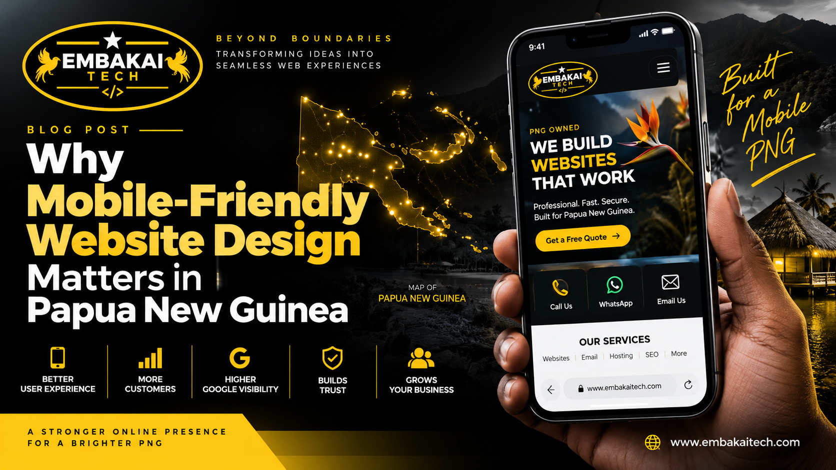
For many people in Papua New Guinea, the first time they visit your business website will not be from a desktop computer.
It will be from a phone.
They may discover your business through:
Then they tap your website link from their mobile device.
What happens next matters.
If the website loads properly, fits the screen, displays readable text, and makes it easy to call, WhatsApp, request a quote, or browse your services, the visitor can continue naturally.
But if the website was designed mainly for desktop computers, the experience can become frustrating.
The customer may see:
Many visitors will not stay and fight with the website.
They will simply leave.
That is why mobile-friendly website design is not an optional extra for a modern PNG business.
It should be part of the website from the beginning.
A mobile-friendly website is designed to work properly on smaller screens such as smartphones and tablets.
The website automatically adapts to the visitor's device.
Instead of displaying the same desktop layout at a smaller size, the website changes its structure so the content remains easy to use.
For example:
This is commonly called responsive web design.
A responsive website can adjust across:
The goal is simple:
Every visitor should be able to use the website comfortably, regardless of the device they are using.
Think about how people usually discover businesses online.
Someone sees your Facebook advertisement.
They tap the link.
Someone receives your website through WhatsApp.
They tap the link.
Someone searches your service on Google.
They tap the result.
In all three situations, there is a strong chance the visitor is already using a phone.
That means your mobile website may create the customer's first impression of your business.
If the mobile experience is poor, the customer may never reach the desktop version.
For many businesses, mobile is no longer the secondary version of the website.
It is the main customer experience.
A good business website should make it easy for customers to take action.
On mobile, this can include:
These actions should be easy to access without zooming or searching through the entire page.
For example, a customer looking for a contractor may only want to:
A mobile-friendly website makes this flow simple.
A poorly designed mobile website adds unnecessary barriers.
One of the easiest signs of an outdated website is when visitors have to pinch and zoom just to read the content.
A modern responsive website should display text at a comfortable size automatically.
Visitors should not need to:
The website should adapt to the screen.
This improves usability and makes the business look more professional.
Desktop websites have much more horizontal space.
A navigation bar may contain:
Trying to squeeze all of those links across a phone screen creates problems.
Mobile websites usually use a collapsed navigation menu, often represented by a menu icon.
When the visitor taps it, the links become easy to access vertically.
A good mobile navigation system should:
Navigation is one of the most important parts of the mobile experience.
If visitors cannot find your services or contact page easily, the website is not doing its job.
Customers form opinions quickly.
A website that feels outdated, broken, or difficult to use can create questions about the business behind it.
Visitors may wonder:
On the other hand, a clean mobile experience communicates professionalism.
The website feels intentional.
The business appears to care about its digital presence.
That matters especially when customers are comparing several businesses.
Many PNG businesses use Facebook as an important marketing channel.
That means they may share links to:
But if most people open Facebook from their phones, your website also needs to work properly on those phones.
A Facebook campaign can generate interest, but a poor mobile website can waste that traffic.
For example:
Facebook Ad → Customer Clicks → Website Breaks on Mobile → Customer Leaves
The advertisement worked.
The website failed.
A better flow is:
Facebook Ad → Mobile-Friendly Landing Page → Clear Information → WhatsApp / Call / Enquiry
Your website and social media should work together.
A website should not only look good to visitors.
It also needs a strong technical foundation for search engines.
Google evaluates websites using many factors, including whether pages provide a usable mobile experience.
That means mobile design should be considered part of your broader SEO strategy.
A mobile-friendly site can support better search performance through:
Mobile responsiveness alone will not guarantee higher rankings.
SEO depends on many factors.
But a website that performs badly on mobile creates an unnecessary disadvantage.
Mobile-friendly design is not only about screen size.
Speed matters too.
A website may technically fit the phone screen and still perform poorly if it takes too long to load.
Common causes include:
For PNG businesses, keeping pages efficient is especially important because customer connection quality may vary.
Your website should avoid forcing visitors to download unnecessary megabytes just to view basic information.
Good mobile websites are designed to be efficient.
High-quality photos can make a website look professional.
But uploading massive original images directly from a camera or phone can slow the website significantly.
For example, a single unoptimised image may be several megabytes.
Multiply that across ten or twenty images and the page becomes unnecessarily heavy.
A professional website should optimise images through:
The customer should see a sharp image without downloading more data than necessary.
Forms are important for many business websites.
Examples include:
If these forms are difficult to use on a phone, customers may abandon them.
A good mobile form should have:
Avoid asking customers to complete twenty fields when five would be enough.
Mobile users want efficiency.
On a desktop, a phone number may simply be text.
On mobile, it can be an action.
A properly configured website can allow the user to tap:
74511449
and immediately open the phone dialler.
This removes friction.
The same principle applies to:
Mobile-friendly websites take advantage of the device customers are already using.
WhatsApp is an important customer communication channel for many PNG businesses.
Your website can make it easy for customers to move from browsing to messaging.
For example:
Read Service → Tap WhatsApp → Start Conversation
A mobile-friendly website may include:
This can be especially useful for businesses where customers want quick answers before purchasing.
Examples include:
The website provides the information.
WhatsApp provides the conversation.
If you operate an online shop, mobile design becomes even more important.
Customers should be able to:
All of this should work comfortably from a phone.
A desktop-only checkout can seriously reduce sales.
If customers cannot easily enter their information or tap the payment buttons, they may abandon the order.
Mobile e-commerce design should be tested carefully before launch.
Payment flows need special attention.
A customer may start on your website and then move through:
Every part of that flow should work on mobile.
If one page breaks, the transaction may fail.
Developers should test:
A website is not truly mobile-friendly if only the homepage looks good.
The entire customer journey must work.
Many applicants may discover job vacancies through social media and open them immediately on their phones.
If your recruitment website requires applicants to zoom, scroll sideways, or use a desktop computer just to apply, you may lose candidates.
A mobile recruitment experience should allow users to:
The process should be simple and clear.
Mobile-friendly design is not only important for commercial businesses.
It also matters for:
Visitors may need to access:
If the website is difficult to use on mobile, important information becomes harder to access.
Responsive design improves accessibility for a wider audience.
Some businesses assume mobile design means stripping the website down until very little content remains.
That is not necessary.
The goal is not to make the mobile website incomplete.
It is to reorganise the content.
For example, a desktop page may show:
Image | Text | Features | Contact Form
On mobile, the same content may stack:
Image
Text
Features
Contact Form
The information remains.
The presentation changes.
Good responsive design preserves the important content while improving usability.
Years ago, some companies created completely separate mobile versions of their websites.
For example:
m.example.com
Modern websites usually do not need this approach.
Responsive design allows one website to adapt to many devices.
This creates a simpler structure for:
The same page can work across desktop and mobile.
That is usually more efficient than maintaining multiple versions.
A developer should not simply shrink a browser window and assume the website works.
The site should be tested properly.
Important checks include:
Different devices and browsers can behave differently.
Testing helps identify problems before customers do.
Typography that looks impressive on a large monitor may become difficult to read on a phone.
Mobile text should have:
Large blocks of uninterrupted text can also be difficult to read on small screens.
Breaking content into shorter paragraphs, headings, and relevant bullet points improves readability.
Buttons on mobile are touched with fingers, not a mouse cursor.
That means they need enough size and spacing.
If two buttons are too close together, visitors may tap the wrong one.
Important buttons such as:
should be easy to identify and tap.
This sounds minor, but small usability details have a large impact on customer experience.
Pop-ups can be useful when implemented properly.
But on small screens, they can easily block the entire page.
Common problems include:
Use mobile pop-ups carefully.
The visitor should always be able to close them easily and continue using the website.
A conversion is when a visitor completes an action you want.
For example:
Mobile-friendly design can make these actions easier.
For example, instead of showing a small contact link at the bottom of the page, the mobile version may display a clear:
REQUEST A QUOTE
button after the service description.
Reducing friction increases the likelihood that interested visitors will actually contact you.
Responsive design should not mean losing your branding.
The mobile site should still use your:
But those elements may be adapted for smaller screens.
For example, a large horizontal logo may need a smaller version in the navigation.
A large hero section may need shorter text.
Decorative backgrounds may be simplified.
The goal is to preserve the brand while keeping the website practical.
A developer can optimise the website, but hosting still matters.
If the server is slow or overloaded, mobile visitors may still experience delays.
Website performance depends on several layers:
Design + Development + Hosting + Caching + CDN + Optimisation
This is why mobile performance should not be treated purely as a design issue.
The infrastructure behind the website also matters.
Depending on your setup, Cloudflare can help improve website delivery through features such as:
A CDN can reduce how much content must be fetched directly from your origin server.
However, Cloudflare cannot fix every badly designed website.
If your page loads massive images and unnecessary scripts, the website still needs optimisation.
Use infrastructure and good development together.
Imagine a potential customer searches Google for your service.
They find your business.
They open the website.
The page requires zooming.
The menu is difficult to use.
The WhatsApp button is hidden.
The text is tiny.
They return to Google and open the next business.
You may never know this happened.
There is no complaint.
There is no support ticket.
There is simply a customer who left.
Poor mobile design can quietly cost businesses enquiries.
Online customers have many options.
If one website is frustrating, returning to Facebook or Google takes only seconds.
This means your website does not have much time to create a good experience.
The site should immediately communicate:
Mobile-friendly design helps deliver that information quickly.
Open your website on your phone and check it like a customer.
Ask yourself:
If you struggle, your customers probably do too.
Some common problems include:
These issues can often be fixed without rebuilding the entire website.
However, very old websites may need a proper redesign.
Before launching your business website, check that it:
A website should not be considered finished until the mobile version works properly.
If your website is already online but performs poorly on mobile, you do not necessarily need to start from zero.
A developer may be able to improve:
However, if the website uses an outdated theme or rigid design, a redesign may be more practical.
The right option depends on the existing code and platform.
For a modern professional website, basic responsive design should normally be part of the project.
Mobile usability should not be treated as an unusual optional feature.
However, advanced mobile functionality may require additional development.
Examples include:
The website quotation should clearly explain the scope.
A mobile-friendly website and a mobile app are not the same thing.
A responsive website runs inside the browser.
A mobile application is installed on a device.
Many businesses do not need an app.
A well-designed responsive website can already provide:
A mobile app becomes useful when the business has specific functionality that benefits from an installed application.
Start with the actual business requirement.
Do not build an app simply because it sounds more advanced.
Some websites can also be developed as Progressive Web Apps, or PWAs.
Depending on the implementation, a PWA can provide capabilities such as:
A PWA sits between a traditional website and a native mobile application.
It can be useful for some projects, but it should be implemented based on real requirements.
For PNG businesses, mobile-friendly website design helps connect your digital marketing with real customers.
Your customers may discover you through Facebook, Google, WhatsApp, advertising, or referrals.
When they reach your website, the experience should continue smoothly.
A responsive website can help your business:
The website becomes more useful because it works wherever the customer is.
Embakai Tech Solutions designs and develops mobile-friendly websites for businesses, organisations, startups, and entrepreneurs in Papua New Guinea.
Depending on project requirements, we can assist with:
Our goal is not simply to make a website fit on a phone.
The goal is to make the entire customer experience work properly on mobile.
It should be part of the website from day one.
For many customers, your mobile website may be the only version they ever see.
If it is slow, difficult to navigate, or broken on smaller screens, your business may be losing opportunities without even knowing it.
A professional mobile experience should make it easy for customers to:
Find you → Understand your services → Trust your business → Contact you → Take action.
That is what responsive website design should achieve.
For PNG businesses building a serious online presence, the question is no longer:
“Does my website work on a phone?”
The better question is:
“Does my website give mobile customers a good enough experience to do business with us?”
If the answer is no, it is time to improve it.
Embakai Tech Solutions can help redesign, optimise, or build a mobile-friendly website that works properly across smartphones, tablets, laptops, and desktop computers.
From responsive design and website speed to WhatsApp integration, hosting, SEO, Cloudflare, e-commerce, and custom development, we can build the complete mobile-ready experience around your business.
Your customers are already on mobile. Make sure your website is ready for them.
Contact Embakai Tech Solutions for a focused review, implementation plan or quote for your organisation in Papua New Guinea.